As part of its service offering for school districts, Master Plan Academy provides advanced data analytics and data visualization capabilities.
We help districts analyze and draw insights from their data for special projects. We can also support districts seeking to build their analytics capabilities by undertaking strategic data assessments.
For more details, visit our Services: District Strategy & Data page. This page provides some samples of the types of data-driven analyses, analytics, and visualizations that Master Plan Academy can provide to level up reports, expand central office data capabilities, and generate insights to drive decision-making.

Benefit from Modern Data Visualizations for Critical Stakeholder Reports
Let’s face it. We have all at times sensed that there is a better, more effective visual than the typical bar graph in Excel. Below are just a couple of examples of powerful visualizations that Neil has developed in the powerful R programming language.
Faceted Scatterplots: Visualizations to Help See Performance of Different Schools Side-by-Side, Across Two Different Years
A picture is worth a thousand words. Sometimes, to facilitate productive discussions at the district level and with key stakeholders, the right visual can speak volumes.
Neil created this powerful graphic in R for a data visualization course. It depicts life expectancy vs. fertility rates, showing side-by-side comparisons by contintent and across two years of two variables that are deeply connected to a country’s level of development. Visuals like this, which can be tough to create in standard software like Excel, can uplevel your report and help ground policy or strategy discussions.
Tile Plots: Visualizations to Compare Performance Across Many Units and Many Years
Tile plots are another powerful visualization that are also very useful when comparing metrics across a large number of units and across time, whether the units are states or middle schools.
Neil developed this visual in R for a data visualization course. It depicts measles rates (per 10,000) across states and across years.
Up-level Your Daily Operations & Leadership Meetings with Customized Reports, Dashboards
Custom Dashboards: In recent years, custom, interactive dashboards have become the standard for BI (business intelligence).
Neil has developed powerful KPI dashboards used by executives to track daily operations for organizations including Kaiser Permanente and the City of San Francisco. While he can’t show these internal data products here, Neil developed this detailed dashboard in a PowerBI course.
A dashboard like this provides several major advantages over typical Excel-based reports:
1) Up-to-date: Dashboards can be designed to refresh their data at a variety of intervals, providing Superintendents and other leaders with timely information.
2) Interactive: End users can quickly drill down into figures of interest
3) Fully Customizable, Customized Access: Dashboard elements, e.g. KPIs, can be incorporated based on stakeholder input. Dashboards can be designed for limited access to leadership, or public access, depending on the need.
Data Modeling: To unlock the power of dashboards requires understanding the valuable datasets you have at your disposal and how they relate to each other.
Master Plan Academy has deep expertise in helping your organization make the most of the variety of datasets you already have, linking them, and unlocking their value.
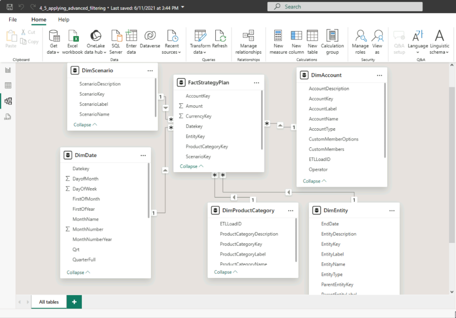
Neil has helped leaders within organizations like Kaiser Permanente and the City of San Francisco by conducting the data modeling necessary to create powerful dashboards. Pictured here is a data model he created for a PowerBI course. In it, he has linked multiple sales datasets for a corporation, allowing these datasets to function together and power the dashboard pictured above.
Enhance Decision-Making on Critical Programs Through Powerful Program Evaluation and Statistical Analysis
Supplement Critical Decisions with Insights from Program Evaluation & Statistical Analysis: To make the best possible decisions on funding special programs and continuing or cancelling them, school districts should leverage statistical analysis where possible. Careful econometric analysis can shed light on a) whether a program likely influenced improved outcomes, controlling for other variables that may influence outcomes and b) the practical extent to which a program improved outcomes.
Optimal decisions on programs require three key elements:
1. A well-conceived plan for measuring the outcome of interest both before and after the policy or program intervention.
2. A strong understanding of all variables that are likely to impact outcomes, even a little bit, and a plan for measuring these “control” variables.
3. A well-designed plan for analyzing the data and drawing conclusions.
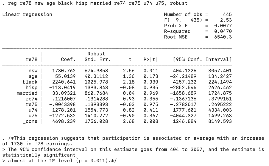
MPA provides school districts with high-value statistical analysis. Neil Dandavati, who taught Probability & Statistics to high school students, was trained in econometric analysis at Berkeley and Harvard. He trained in advanced program evaluation methods with Prof. Alberto Abadie. Neil guides school districts in setting up econometric analyses and guides them in interpreting results. Ex: The econometric analysis pictured here was run by Neil (in Stata). It demonstrated that participation in a particular program was associated with a statistically significant and practically significant increase in earnings. These results were significant at the 1% level.
Gain a Powerful New Economic & Policy Lens to Drive District Decision-Making
Strategic Analysis of District Operational Data: School district central offices are more strapped than ever, with fewer staff than ever, who can provide critical analytical support.
Master Plan Academy extends the analytical capacity of districts for project and special initiatives that most demand it. We are able to generate insights from district data and even from analysis districts have already conducted.
In 2023, a large school district examined school closure of a top-performing middle school, as an option to achieve scale economies and reduce annual operating costs in a challenging fiscal environment.
In the first slide to the left, Neil reproduced slides from a school district report and then generated a new metric to aid the district in evaluating potential upsides to keeping the middle school open: administrative efficiency in serving students with special needs. Leveraging district data, his analysis showed that the middle school in question actually had the highest ratio of students with special needs to administrators (and was serving those students well, as evidenced by achievement indicators). In the second slide to the left, Neil expanded on the district’s analysis of declining student:teacher ratios and focused on cost per student as a metric of interest. His analysis showed that a) the school in question was already fairly efficient in cost per student, and that b) small changes in enrollment could substantially improve cost per student.
Cost Benefit Analysis: The fiscal decisions facing districts are often extremely challenging.
Master Plan Academy has deep expertise in driving fiscal decision-making for large public entities, but also bringing an economics lens. Neil was a budget and finance lead for the City of San Francisco, where he partnered with eight City departments to budget over $130M in funds annually. He also served as the manager of the citywide tech portfolio, in which capacity he helped the Mayor’s office allocate over $35M in funds for annual tech projects.
However, to shed light on net impacts and long-term impacts of otherwise appealing options, budgetary analysis must also be supplemented by economic frameworks. Neil studied economics and cost-benefit analysis at the Harvard Kennedy School, where we was also a Michael Dukakis Governor’s Fellow and advised the executive team of Massachusetts Governor Deval Patrick on education and health policy. In the analysis pictured here, Neil extended a district’s analysis which showed that middle school closure would generate a mean of $400K in annual savings. Incorporating the impact of lost per student revenue could erode those savings down to $175K (under certain assumptions including that no staff would be laid off). The analysis then explained that for closure to be an optimal decision, any benefits of retaining the middle school (e.g. preserving a CA Distinguished School that performs well with special-needs students) should be weighed against remaining savings.


